Banners
Banners allow you to configure and display instance-wide messages to all users of your Unleash instance. These messages appear at the top of the Unleash UI and can be configured to be interactive.
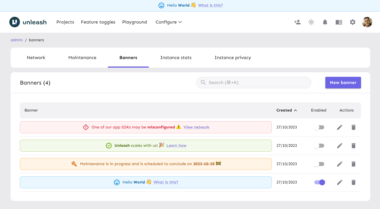
A common use case for banners is to pre-configure messages that you can enable when needed. For example, you might have a banner for scheduled maintenance or another to announce a user survey.
Banners can be enabled or disabled at any time.
Create a banner
To create a banner in the Admin UI, do the following:
- Go to Admin settings > Instance config > Banners.
- Click New banner.
- Configure the status, type, icon, message, action, and whether the banner should be sticky.
- Click Add banner.
Once created, if the banner’s status is set to enabled, the banner is immediately visible to all users in your Unleash instance.
Configure the banner
Use a custom icon
To further personalize your banner, you can use any icon from the Material Symbols library.
To use a custom icon:
- In the banner configuration, select Custom from the Icon dropdown menu.
- In the Banner icon field, enter the name of the desired Material Symbol. For example, to use the “Rocket Launch” icon, enter
rocket_launch.
Configure a link action
This action displays a link on the banner that directs users to a specified URL.
- Absolute URLs (for example,
https://docs.getunleash.io/) open in a new browser tab. - Relative URLs (for example,
/admin/network) open in the same tab.
Configure a dialog action
This action displays a link on the banner that, when clicked, opens a dialog box with additional information.