

Developer Toolbar
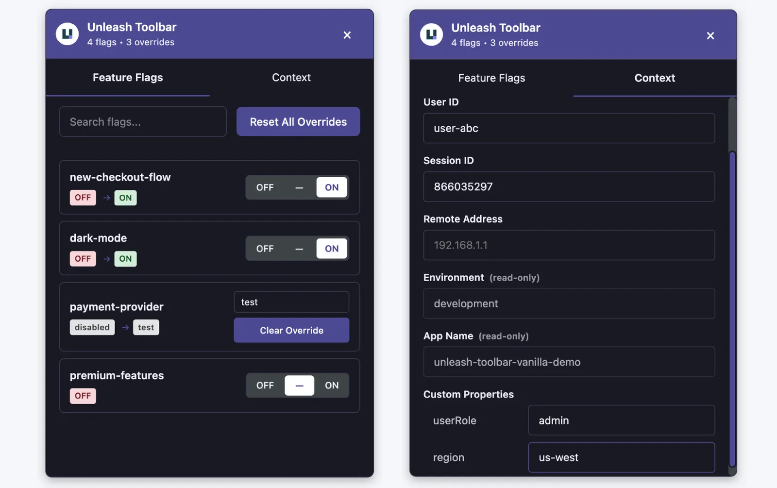
The Unleash Developer Toolbar lets you override feature flag values and context properties at runtime without making server changes. It’s designed for local development and testing workflows where you need to quickly test different flag configurations or context values.
Key features
- Flag overrides: Force boolean flags on or off, or select specific variant values
- Context overrides: Modify
userId,sessionId, and custom properties to test targeting rules - Persistence: Choose between memory, session, or local storage for your overrides
- Framework support: Works with React, Next.js, Vue, Angular, and JavaScript
- SSR support: Cookie-based state sync for server-side rendering in Next.js
- Movable and dismissible: Drag the floating icon to any window edge, minimize it to the icon, or hide it entirely until the next page refresh
- Keyboard support: Open and close the toolbar with a configurable shortcut, operate every control from the keyboard, and dismiss it with
Esc - Screen reader support: Landmark, tab, and radio group semantics, labeled controls, and visible focus indicators
- Custom banner: Show an optional message (with an optional link) to clarify the toolbar’s scope for your team
The toolbar is intended for development and testing environments only. Don’t use it in production unless you’re building a public demo where users interact with feature flags without Unleash access.
Installation
Choose the installation command for your framework:
JavaScript
React
Next.js
Import the CSS file to load the toolbar styles:
Quickstart
JavaScript
React
Next.js
Vue
Angular
The initUnleashToolbar function wraps your UnleashClient and returns a client with the same API. Use the wrapped client for all flag evaluations.
Configuration options
Storage modes explained
local(recommended for development): Persists across all tabs and browser restarts. Set overrides once, test everywhere.session: Persists within the current tab only. Useful for testing different configurations in multiple tabs simultaneously.memory: No persistence. Clears on every page reload. Use for quick one-off tests.
Moving and hiding the toolbar
- Move it: Drag the floating icon to any window edge. It snaps to the nearest edge and remembers its position across reloads. Set
draggable: falseto disable dragging and keep the configuredposition. - Minimize it: Click the minimize (
_) button in the panel header, or pressEscwhile focus is inside the panel, to collapse the panel back to the floating icon.Escalso returns focus to wherever you opened the panel from. - Hide it completely: Click the close (
×) button to hide both the panel and the icon. This is temporary; the toolbar reappears (minimized) after a page refresh.
Adding a banner
Use the banner option to display a message in the toolbar, for example to clarify which flags the toolbar can override. Optionally add a link with bannerLink (and customize its label with bannerLinkText).
Keyboard and accessibility
The toolbar is fully operable from the keyboard.
Keyboard shortcuts
To open the toolbar panel, or move focus into it when it’s already open:
- Windows/Linux:
Ctrl + Shift + F - macOS:
Cmd + Shift + F
Pressing the same shortcut again from inside the panel minimizes it.
Once the panel is open:
Use the shortcut option to rebind the shortcut if it conflicts with one in your app, or set it to false to register no global key listener:
Shortcut-driven setup
To render nothing until the toolbar is summoned, and open it with focus already in the flag search box:
The toolbar stays mounted while closed. It’s hidden with display: none, so there’s no re-initialization cost when it reopens, and it stays out of both the tab order and the accessibility tree while hidden.
With both showToggleButton: false and shortcut: false, users have no way to open the toolbar; only the programmatic API can. Keep at least one of them enabled.
Focus behavior
The panel isn’t modal. The page underneath stays interactive, is never marked inert, and focus is never trapped, since watching your app react to a flag change is the point of the tool and keyboard users need to be able to get back out to it.
When you open the panel from the keyboard, focus lands on the panel itself rather than on a control, so screen readers announce the region and its name. The panel also draws a focus ring so that sighted keyboard users can see that focus has left the page. The ring stays off when the panel is opened by clicking the floating icon.
From there, focus is tethered to wherever you summoned the panel from:
Taboff the last control, orShift + Taboff the first, returns focus to the element you opened the panel from and leaves the panel open. The nextTabcontinues through your page from that point.- The shortcut is the way back in. Pressed from the page while the panel is open, it pulls focus into the panel instead of closing it. Pressed from inside the panel, it minimizes.
Escminimizes and hands focus back to the same element, or to the floating icon if the icon is what opened the panel.
If there’s no element to return to, because the panel was opened by clicking the icon or the original element has been removed from the page, Tab follows the browser’s normal order.
Calling hide() from your own code only moves focus if the toolbar currently holds it, so hiding the toolbar programmatically never interrupts a user who is working in your app.
Screen reader support
- The panel is a labeled
regionlandmark, so assistive technology can jump straight to it regardless of where the toolbar sits in the tab order. - Tabs follow the WAI-ARIA tabs pattern, with arrow-key navigation and a single tab stop.
- Each flag’s off/default/on control is a
radiogrouplabeled with the flag name, so assistive technology reports which state is in effect. The group is a single tab stop, so you can move past a flag with oneTabpress instead of three. - Icon-only controls have visually hidden text labels rather than relying on tooltips.
- Animations are suppressed when the user prefers reduced motion.
Focus ring color
The keyboard focus ring follows themePreset automatically, and both presets meet the 3:1 contrast ratio that WCAG requires of non-text indicators. Controls on the colored header use a white ring instead, since primaryColor is already required to be dark enough for the header’s white text.
Set theme.focusColor only if a custom backgroundColor leaves the default ring hard to see, for example a dark background while staying on the light preset:
API reference
Access the toolbar instance via window.unleashToolbar:
Next.js server utilities
Bundle size
The toolbar is optimized for minimal impact:
Of the core bundle, only ~2.4 KB is the entry point. The panel UI (~9.6 KB) is a separate chunk loaded asynchronously, so it doesn’t block your initial bundle.
Requirements
- Browser: ES2020 support (Chrome 90+, Firefox 88+, Safari 14+)
- SDK versions:
unleash-proxy-client^3.0.0@unleash/proxy-client-react^5.0.0 (optional)@unleash/nextjs^1.0.0 (optional)
Troubleshooting
Toolbar doesn't appear
Make sure you’ve imported the CSS file:
Check that you’re using the wrapped client returned by initUnleashToolbar(), not the original client.
Overrides don't persist
Check your storageMode setting. If set to 'memory', overrides clear on page reload. Use 'local' for persistent overrides across sessions.
Server components don't reflect overrides
For Next.js SSR, ensure you’re using applyToolbarOverrides() in your server components and that enableCookieSync is enabled in your toolbar options.
Hooks not re-rendering on override changes
The wrapped client emits 'update' events when overrides change. If you’re using a custom setup, make sure you’re listening to these events and triggering re-renders.
Keyboard shortcut doesn't work or conflicts with my app
The toolbar only reacts when the modifiers match exactly, so a shortcut like Cmd + Alt + Shift + F still reaches your app. If the default conflicts anyway, rebind it with shortcut: 'mod+shift+u', or set shortcut: false to register no global key listener and open the toolbar through toolbar.show() instead.
If the shortcut does nothing at all, check that another handler on the page isn’t calling preventDefault() on the keydown event before it reaches the toolbar.